Drawing systems and processes
Layout, labels and five colours
A diagram can contain the right parts and still make them hard to understand. If the next thing in a request path sits behind the previous thing, the reader keeps changing direction. If a line crosses three boxes, they have to decide whether it connects to them. If labels float halfway between two arrows, they have to guess which relationship you meant.
Layout is the work of removing those unnecessary decisions. It gives the eye a route, separates different kinds of information, and leaves room for the conversation to change the picture. You can do much of it with a single black pen. Additional colours help draw attention once the arrangement is sound.
We will continue the repair-service board from Drawing at the whiteboard. A browser calls the Repair API. The API stores a request and a notification job in the Repair DB. A worker reads jobs and asks an external provider to send an email. These are the agreed relationships in our invented example. Whether the provider prevents duplicate email requests is still an open question.
Arrange the page around its question
While people speak, it is natural to place each new thing wherever there is space. That gives the board the order of the conversation. Someone reading it later needs the order of the explanation.
In the first arrangement below, the browser and database occupy the top row because they were mentioned first. The API was squeezed below them, then the worker and provider were added at the bottom. Every necessary relationship is present. Following the request still requires a turn down to the API and back up to the database.
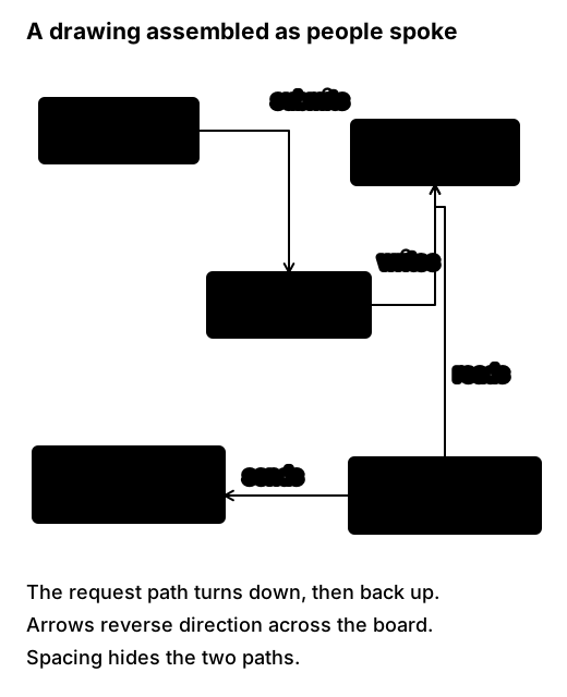
Before redrawing, decide which relationships deserve the first reading. Here the useful distinction is between recording the request and sending the notification. Put the browser and API together. Place the database below the API, with enough room beside it for the worker’s separate read. Put the provider after the worker. The resulting arrangement has two recognisable paths sharing one store.
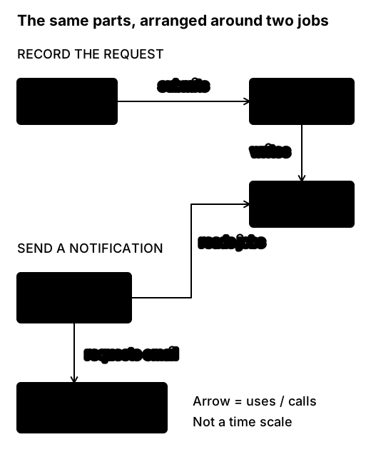
A left-to-right flow often works on a wide board. On a narrow page, a top-to-bottom arrangement gives labels more room. Preserve the relationships when changing orientation. A reader should not have to infer that a request now travels in the opposite direction because the illustration has been made to fit a phone.
Architecture relationships need not all point one way. A worker may call back into a store shared with another path. Use a bend and a clear label when that is the truthful connection. Forcing a tidy chain by reversing that arrow would change the explanation.
Give the drawing a hierarchy
Use three levels of emphasis. The title and question tell people what they are looking at. The main shapes and paths carry the explanation. Small notes hold qualifications, questions and references beside the part they affect.
At a physical board, write one test label and step back before filling the space. If someone at the far side of the room cannot read “Notification worker”, shorten the label or write larger. “Worker” may be enough if the title and surrounding prose establish its job. A legend of tiny abbreviations merely moves the reading problem elsewhere.
Make similar things similar in size. Two services with equal importance should not look as though one dominates the other because its name happened to be longer. Leave room for the longest useful label, then use that box size for its peers. A database’s cylinder need not be taller than the services to be recognisable.
Make boundaries lighter than the objects they contain. A heavy enclosing rectangle competes with every box inside it. Label the boundary at its edge: “Repair service”, “Customer device”, or “External provider”. A boundary can mean ownership, execution location or trust, so write which one you mean. Leave a visible gutter between neighbouring boundaries; touching outlines can look like one shared container.
Keep notes out of that gutter when it is needed for connections. Reserving space is a practical way to avoid later squeezing. A useful starting arrangement leaves roughly a quarter of the board for questions and decisions, although the actual space depends on the meeting. The point is to leave somewhere to put the fact that does not fit yet.
Make arrows readable
Connect from the nearest sensible sides of two shapes. Give a connector a short straight departure before its first bend, and keep its arrowhead clear of the destination label. If you need to run behind a box, move the line around it. A line passing through a shape implies participation even when that was not intended.
Put the relationship label beside a clear stretch of its connector. “Stores request + job” belongs near the API-to-database line. “Data” tells the reader too little to distinguish it from the worker’s “reads jobs” connection. When the direction matters, read the label as a sentence: “Repair API stores request and job in Repair DB.” That catches many reversed arrows.
Use two directed, labelled connections if a bidirectional relationship genuinely needs two meanings. A double-headed line marked “communicates” hides which side initiates work and what each side sends. If the question becomes the order of request and response, move to a sequence diagram, where those messages have their own space.
Where lines cross, avoid placing a junction dot unless they really connect. Better still, move a node to remove the crossing. A small line hop can distinguish a crossing on an informal drawing, but it becomes another convention to explain. Fewer crossings usually cost less than more notation.
These are layout choices for informal diagrams. Formal notation may already assign meanings to line styles and arrowheads. A dashed message flow in BPMN or a dashed reply in a sequence must not be repurposed as “uncertain” because it happens to look lighter.
A palette for five pens
Five colours are enough for useful emphasis. They are also enough to create five conflicting classification systems. Decide what colour means on this board before assigning it to objects.
Here is the convention used throughout the whiteboard examples. It is a local convention you can explain in one corner, not a standard notation.
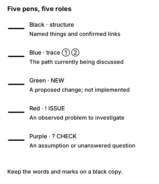
Draw the base structure in black. Trace the particular case being discussed in blue, using numbers such as ① and ② beside the relevant connections. Those numbers identify this walkthrough; they do not turn the architecture drawing into a complete sequence model. Remove the temporary trace when the conversation moves to a different case.
Use green for a proposal, with NEW written beside it. For the repair service, “NEW: show notification status” belongs in a proposal area until the group has decided what it means. Use red for a known issue, paired with ! and a brief description. “! Two emails observed for R17” is evidence of a problem; it is not yet evidence of its cause. Use purple for uncertainty, paired with ?: “? Can provider requests duplicate?” Name someone to check it if the answer matters to the decision.
If the available pens are black, blue, red, green and orange, assign orange the uncertainty role. The role matters more than the precise hue. If only black works, keep the numbers, NEW, ! and ?. The drawing loses emphasis but retains its interpretation.
Avoid spending the same green on both “database” and “proposed”. An existing database would then appear to be a change. If object categories are the question you need colour to answer, choose a category palette for that drawing and explicitly replace this one. Do not ask a single mark to carry two unrelated keys.
Keep uncertainty attached to the claim
An unknown at the edge of the board is easily forgotten. Attach the note to the relationship it qualifies. In the example below, the question concerns the provider’s handling of repeated requests, so it sits beside the worker-to-provider call. It does not cast doubt on the existence of the worker or database.
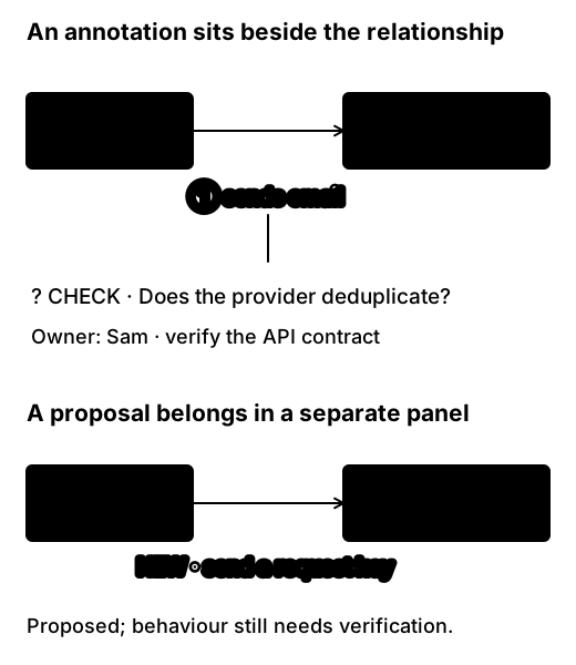
Keep current and proposed behaviour in separate panels when a change adds or removes relationships. Overlaying green lines can work for one small addition. With several changes, people start following a route made partly of current connections and partly of proposed ones. Give each panel its own title and repeat enough context to interpret it independently.
A similar discipline helps with disagreement. Write “Coordinator: email sent manually” and “Developer: email sent by worker” as two claims while you investigate. Blending them into one unlabeled line creates an apparent agreement nobody actually reached.
Colour, contrast and copies
A faint yellow line may look pleasant close to the board and disappear in a photograph. Use dark pens for small lettering; save lighter colours for broad underlines or halos that supplement a readable label. On a dark digital canvas, use lighter strokes with adequate separation from the background. A direct inversion of a colourful drawing can make some relationships much harder to see.
For published diagrams, pair colour distinctions with text, shape or another visible cue. That follows the principle in W3C’s guidance on use of colour. Our marks are one way to do it. They do not replace an accessible text description of a diagram’s relationships.
Check the result in the form in which people will receive it. A whole-board photograph shrunk into a document may make every label unreadable. Crop into meaningful panels, retain a small overview for orientation, and include the question and legend with each exported view. Put an explanation beside the picture for someone who cannot see it or is searching the document by text.
Practise repairing a layout
Draw the five repair-system parts on paper in the order they were mentioned in the first figure: browser, database, API, provider, worker. Connect them accurately. Then put the pen down and follow the submission path with your finger. Notice each time you hesitate over a label or turn across another connection.
Redraw the same relationships with two goals: make the submission path easy to find and keep the worker’s read distinct from the API’s write. Add the provider question with a question mark. Make one proposal in a separate panel. Finally, cover the coloured strokes and read the black labels and marks.
The second figure is one possible arrangement, not the answer you must reproduce. A vertical version could work equally well. The important tests are whether the worker still reads the store, whether the proposed change remains separate, and whether another reader can identify the uncertainty without knowing which colour it used. A neat arrangement that changes any of those relationships needs another pass.